Colourful and Artsy Home In Costa del Sol

Here’s a sneak peek to my latest project. This is a totally, absolutely completely renovated house in Torreblanca, Andalucia. Architect Daniel Perez Malmberg designed the house and I added the final touch. As I mentioned this is only a quick look to the house inside. In the 2-storey home there’re still things to do and I’m waiting for pieces of furniture to be delivered, art work to hang on the walls etc.

Btw, the huge painting in the living room is painted by former boxer/now artist Eva Wahlström.

Torreblanca_home_1.png
Torreblanca_home_2.png
Torreblanca_home_3.png

5 Tips How To Add Christmas Spirit To Your Home

Holiday season is here! If you haven’t had time yet to concentrate on making your home Chrismassy - no worries - here are some easy tips to create that wonderful atmosphere at home.

Candles

Have candles around your home. They can be scented or unscented. I usually prefer the latter ones as it’s pretty hard to find candles with natural, fresh and yet mild enough scent. Speaking of which, I have found these 2: Cotton scented candle at HM Home and eucalyptus scented one at Zara Home. A bit more luxurious brand Diptyque has a beautiful variety of natural scented candles. Remember not to leave a burning candle unattended.

Music

Put the music on! Christmas songs and carols definitely creates holiday spirit. However, if you don’t want to listen to the traditional songs, you can easily find instrumental versions played by piano or a classical orchestra. Jazz versions are cool too!.

Flowers

Flowers are my favourite. As soon as I see the first hyacinth bulbs in flower shops (or in Ikea), I just have to buy a few ones. To see them grow and then blooming and spreading wonderful scent around, I definitely feel that Xmas is around. Amaryllis is the other flower that brings the authentic feel. A simple bouquet of tulips in red or white is perfect for Christmas. I’m not sure if tulips are popular Xmas flowers only in Scandinavia, hmm.

Wreath

A beautiful wreath on your front door tells that you are ready for Xmas. It’s not just for you but also for everyone passing by. It lifts the spirit of so many people. If you have time you can make a wreath yourself or buy a ready one from a talented florist - in Budapest I can highly recommend flowerMe.

Sparkle

Let it sparkle! Even if you are not a bling-bling person, perhaps you can add a bit of sparkle at your home in Christmas time. Choose some golden or silver items, make displays with shiny balls, add light garlands and glitter garlands. You will see how festive your home looks and feels.

Have a wonderful Christmas time!

Xmas_vibes.jpg
A Xmas wreath by flowerMe.

A Xmas wreath by flowerMe.

How To Choose The Colour Theme For Your Home

We all have our favourite colours. This doesn’t mean that all the colours around us have to be in that specific tone. Sometimes it can be difficult to choose a colour, especially if it’s something you see every day, affects to your mood or costs a lot of money. Choosing colours for your home can be confusing - suddenly you see so many different options. I have collected here a few tips to make it easier for you to find the right colour palette.

  1. Get Inspired

    You can find your colour inspiration in a holiday photo, your fave cashmere pullover, flower field or by looking out of your window. Perhaps you are looking for a certain atmosphere and you want your home to be fresh, dramatic, bright, moody, cosy or what ever you feel.

  2. Start with neutrals

    Neutral hues are those basic ones such as white, grey and beige. Keep in mind that there are a wide variety of neutrals- not all greys are cool, and not all beiges are warm. It is completely possible to choose both grey & beige - just make sure they are both in same tone level; either cool or warm side. Even white has plenty of different tones.

    In case you like to have different colours in each room, keep the same neutrals in every space. That pulls the whole home palette together.

  3. Add Two Accent Colours

    When the neutrals are picked up, go for the ‘real’ colours. Even if you think that you don’t want to add any colour for your place, I recommend you to choose at least one colour. You will see the difference in atmosphere just by adding a tiny hint of a colour. It can be a stripe in a cushion, a glass vase, a poster on the wall.

  4. Create A Moodboard

    Choose one or more pictures which represent those colours or that atmosphere you are looking for. Pick up the main shades and you get a beautiful colour palette.

PS. if you still find it too complicated and time-consuming, I’m here to help you. Just drop me a message tiina(at)tiinaarminen.com and I’ll make you a perfect colour scheme for your home.

Here’re 3 example how I create a colour palette moodboard:

Btw, you can find out more about moodboards here!

.

colourpalettemoodboard

4 tips For Decorating A Mantel

It is the season when you want your home to be as cosy as possible, bundle up and read a book. Warming a fireplace and just staring the flames and enjoy the warmth.

Mantel is easily a place where you place any small item that you cannot find any other place - isn’t that true? What about if this year you make your mantel a real eye-catcher? Sounds easy, and it is pretty easy if you follow these simple tips.

1. Leave Some Space

When decorating a mantel don’t fill up every single space. Leave some space in-between the objects or concentrate on a part of the mantel without spreading things all over. This way you create a pleasant flow and avoid overwhelming.

2. Create Contrast

Choosing objects in different sizes, shapes and colours makes the mantel setting more interesting and nice to look at. You can choose for example candle holders in different heights, picture frames in square and rectangle form, round and sharp bowls & vases.

3. Avoid Symmetry

In mantel and console table decorations asymmetry is more fascinating than symmetry. Funny to say but the balance is better when the balance is not that obvious. The whole setting looks more spontaneous - even though it is carefully designed - relaxed and cosy.

4. Add Dimension

This is easy to access by placing the object partly in from of each other, for example a smaller framed picture can be partly overlapping a bigger one. avoid clear rows where everything is by side on the same level.

What To Place On A Mantel?

  • candle holders

  • framed pictures

  • vases

  • bowls

  • mirrors

  • plants

  • what ever you like to have there

It is easy to make chances in mantel decoration depending on the season. Check these Christmas decor options here.

mantel-2.png

Make Your Rental Feel Like Home

How To Make a Furnished Rental Apartment Your Home?

Making a furnished rented apartment feel homey can sometimes be a bit hard. Especially when your decorating options are limited by rental rules. But you can still make a space your own with a few design ideas. Here’s an example:

Laura fell in love with the light and airy feel of this apartment - and with the breathtaking sea view! The flat was renovated and furnished with white pieces, but the style was not exactly what Laura prefers and the living room was not functional for her. She needed a space for practising yoga, making videos and online yoga courses.

First we rearranged the furniture. The couch was pretty heavy but we managed to move it - we put blankets under the leg avoiding scratching the floor - from its original place in the front of the window to the other side of the room facing outside - now Laura can enjoy the sea view and watch TV while sitting on the sofa as the wall mounted TV set is adjustable.

Dining table got its new place by the window. The table will work also ask her home office desk, so it is essential to have as much natural light as possible. Laura had her own chairs, so we replaced the existing ‘antique’ chairs.

Now Laura has one side of the room free from all big furniture and place for yoga. She can make nice settings for her video backgrounds. She has a nice collection of small Buddha figures, yoga pillow and other yoga related items.

After having the pieces of furniture rearranged it was time to declutter. The apartment has two bedrooms and some closet space, so Laura can use the other bedroom (guest room) as a kind of storage room too. Laura prefers clean lines so it was important to remove all disturbing items -such as wall and table decor, and textiles as well - and replace them with Laura’s own ones.

Laura had her own cushions, blanket and rugs. Those are things that make the place immediately feeling your home.

Easy Tips For Decorating a Furnished Apartment

  1. Rearranging for a new look

    Rearrange the furniture to suit your needs in the room. Just because the apartment comes furnished it doesn’t mean the furniture has to stay in exactly the way you found it.

  2. Rug decor

    With a rug you can totally change the look of a furnished apartment. If there is an existing rug, replace it if you prefer another style.

  3. Personalising your space

    You want to make it your home and have your own personality and interests present, in order to feel at home. Remove or replace the knick knacks.

Just add some flowers and plants, and the place is yours!

Homey feeling!

Homey feeling!

Make it functional for you.

Make it functional for you.

Rearrange the furniture and make it functional for you.

Rearrange the furniture and make it functional for you.

Remove the disturbing knick knacks and replace them with your own ones.

Remove the disturbing knick knacks and replace them with your own ones.

Now there’s space for yoga.

Now there’s space for yoga.

IMG_6710-2.jpg
Before

Before

Before. Look at that view!

Before. Look at that view!

Pretty And Peaceful Bedroom In Blush Pink

This bedroom was supposed to be ready in the beginning of the year. As this spring and summer have been a bit different due to COVID19, we had to put the project on hold and wait until it was at least a bit safer to work away from home again.

In this project I mainly played with textiles and small items. In the bedroom there were already a bed, cupboard for clothes, bedside table and stool. On the wish list there were an armchair and lamp for reading, a rug to hide her yoga mat and a shelf unit for books. She also wanted to have a cosy feeling for the room.

The bedroom was very white with white walls, white bed and bedlinen, but there were also some bright colours in the cushions and paintings. I wanted to tune the colours a bit down. Dusty shades of pink together with beige and brown hues would give a soft and warm look when combined with crispy white walls. Golden finishes in metal items also bring warmth and gives a fresh luxury feeling.

I started the project by creating a moodboard. This way I made it easier for my client to see how the colours as well as the existing and new items would look together. Due to Covid19 we didn’t go shopping together, instead I gave her the links of the pieces and she could order everything online.

Now most of the items have arrived, and last week we could make some progress there. We are still missing the floor lamp, small table by the armchair and big pillows for the bed. Otherwise it starts to be ready.

Here’s a sneak peek for a pretty and peaceful bedroom in dusty shades of pink.

Pom poms give some colour and creates a boho atmosphere.

Pom poms give some colour and creates a boho atmosphere.

bedroom_decor_9.jpg
bedroom_decor_7.jpg
bedroom_decor_10.jpg
Bedroom moodboard with shades of blush pink and golden accents.

Bedroom moodboard with shades of blush pink and golden accents.

4 Easy Ways To Fresh Up Your Home

You don’t need to break a bank to update and fresh up the atmosphere of your home. There are plenty of inexpensive and affordable solutions. We all love to have a cosy home where to feel good. Now due to this corona pan-epidemic money can be tight and there’s no extra to spend around.

Here are some tips how to make it without a big budget.

1. Paint A Wall

New paint has a significant effect on the mood of the room. You don’t need to paint the whole room yet just one wall so called accent wall. It brings personality to the space. Choose any colour you want. It can be bright yellow, calming blue or natural beige. Painting one wall is not a huge job and you can probably do it yourself without hiring anyone. Remember you can always paint it again if you prefer another tone after a while. So it is not a structural issue.

2. Buy A Plant

Having leafy greens at home has been a trend for some time now. Plants really makes a difference in the mood and they have benefits too - such as cleaning the air inside. If you already have plants, check if they need new soil or perhaps plant them in a new pot. At the moment big plants such as monsteras are popular as well as hanging baskets.

3. Update Cushions

You don’t need to change the whole interior of a room. Check which textiles you could change to new ones. Even a couple of new cushion covers in different colours fresh up the atmosphere. Or change your grey curtains to white, for example. You can even try some bold patterns. At draper’s there are usually a corner where they sell smaller pieces of fabrics I reduced price. That’s my favourite corner!

4. Hang Some Art

If you have frames in different sizes and colours, make a collage with them. Place some photos, drawings, piece of fabric, wallpaper or what ever you like in these frames. Then gather them in a group and hang on a wall. Grouped installation looks better than several pieces around your home. If you need some new pics, check if you can find something you like here.

I made a moodboard based on greens.

Easy way to fresh up your home.

Easy way to fresh up your home.

What Is E-Decor Service?

You are probably wondering what is this e-decor service that has become popular these days, especially now due to this corona virus panepidemic. E-decor service is an online interior decorating service which is delivered to the client digitally via email. The e-decor service usually includes a layout, colour scheme and list of furniture and decor items with links where to buy them. It can be a whole house or just one room which needs a makeover.

How E-Decor Service Works?

In the beginning you will be asked some questions such as:

  • Which styles & colours you prefer? Or which ones you don’t like at all?

  • What is the size of the space?

  • What is your budget?

  • Is the space empty or are there pieces of furniture you like to keep?

  • Do you have preference pictures or a Pinterest board with design inspiration?

  • A couple of pictures of the space would also be needed

During the process there might come up some questions or more information is needed.

Why To Choose E-Decor / Online Interior Design Service?

  • It is time saving. You don’t have to do all of the online searching by yourself nor try to figure out what actually works in your own place.

  • You might want to redesign your home but don’t know where to begin. Perhaps you are stuck with the layout and feel something should be done but cannot imagine having your sofa in another place yet it is disturbing you.

  • You are afraid of making mistakes in choosing pieces of furniture, painting your walls or shopping decoration items, and there for you do nothing to enhance your living spaces.

  • You will receive a ready-made plan and shopping list, so all you need to do is order the items online or go out for shopping and then place all the pieces according to the plan. Super easy!

For example:

  • if you have all your big items but don’t know how to pull it all together.

  • You need to furnish your new home on a realistic budget.

  • You have just moved and need a living room that makes you feel at home.

  • Your home is almost put together but you could use a new rug.

What do think - would e-decor service be the right solution for you?

PS. Here’s an example of a moodboard I made for my e-decor client. She wanted to refresh the family living room yet keep the main pieces of furniture such a sofa, armchairs and piano. There was also that beautiful blue Kiuru (Skylark) wallpaper by Birger Kaipiainen on one wall and the white Lokki design lamp by Yki Nummi, which both made the base for my planning. She had a lot of green plants and plenty of books. I wanted to update the place with light pieces to make it airy and make it inviting for the whole family.

Blue and grey with watery shades of greens create a beautiful fresh and relaxing colour scheme. I wanted to add a tiny bit of black to sharpen the overall look. Brass brings some luxury and updates & upgrades the room. I changed the wooden open book shelf to a white one with glass doors.

All the items on her shopping list are easy to buy in Finland, where she lives. And I was delivering it for her from Budapest. That’s how it works:)

Moodboard based on Kiuru wallpaper and Lokki lamp.

Moodboard based on Kiuru wallpaper and Lokki lamp.

Ikea Botanisk Limited Collection

Ikea did it, again! Absolutely a wonderful idea to have this Botanisk limited collection, which is not only organic and beautiful but also creating jobs for local artisans. Now you can create your own garden without having a huge outdoor space.

Dig into BOTANISK

BOTANISK collection is created in collaboration with six social entrepreneurs in India, Thailand, Jordan and Romania. They all have business ideas that are based on creating jobs in regions where they are most needed, and for people that need them most.

Today, IKEA has 27 social business partners in 15 countries across the world, and the number keeps growing. It means 20 100 jobs - 5300 artisans and 14 500 small scale farm holders. The ripple effect improves the lives of 140 000 family members.

Whether you’re a plant swapper, urban gardener, or simply dream of growing a green thumb, BOTANISK has what it takes to sort you out. From tool kits and clay pots to large baskets, this handmade collection doesn’t only add to the fun of indoor potting – it creates jobs in regions where they are most needed. Let’s sprout some seeds of hope!

Sustainable in more ways than one

“The whole collection is made with people in mind. From start to finish the process has been all about the collaboration, developing the items together.” Maria O’Brian, Creative Leader IKEA.

A collection that grows on you, literally

Best of all, you don’t need a garden or even a balcony to enjoy all the lush greatness. Your apartment jungle is just a few pots and plant swaps away, which is exactly what BOTANISK is all about.

Seeds, sugar snaps and green ideas

While growing monsteras and vegetables are good for you – it can also get messy. Luckily, there’s BOTANISK tool storage (and more) to organise your gardening sessions. All in natural materials that feel great to touch and use.

Leaves that sprout new jobs

“We designed it together with an Indian seamstress, an expert embroiderer. After we’d shown her our general idea, she came up with great suggestions on how to do the leaves.”Paulin Machado, IKEA designer.

ps. This is not a paid partnership post - just to let you know. The text is mainly from Ikea’s website.

Ikea Botanisk limited collection is here!

Ikea Botanisk limited collection is here!

These cushions are my favourite!

These cushions are my favourite!

Call It Grey or Gray!

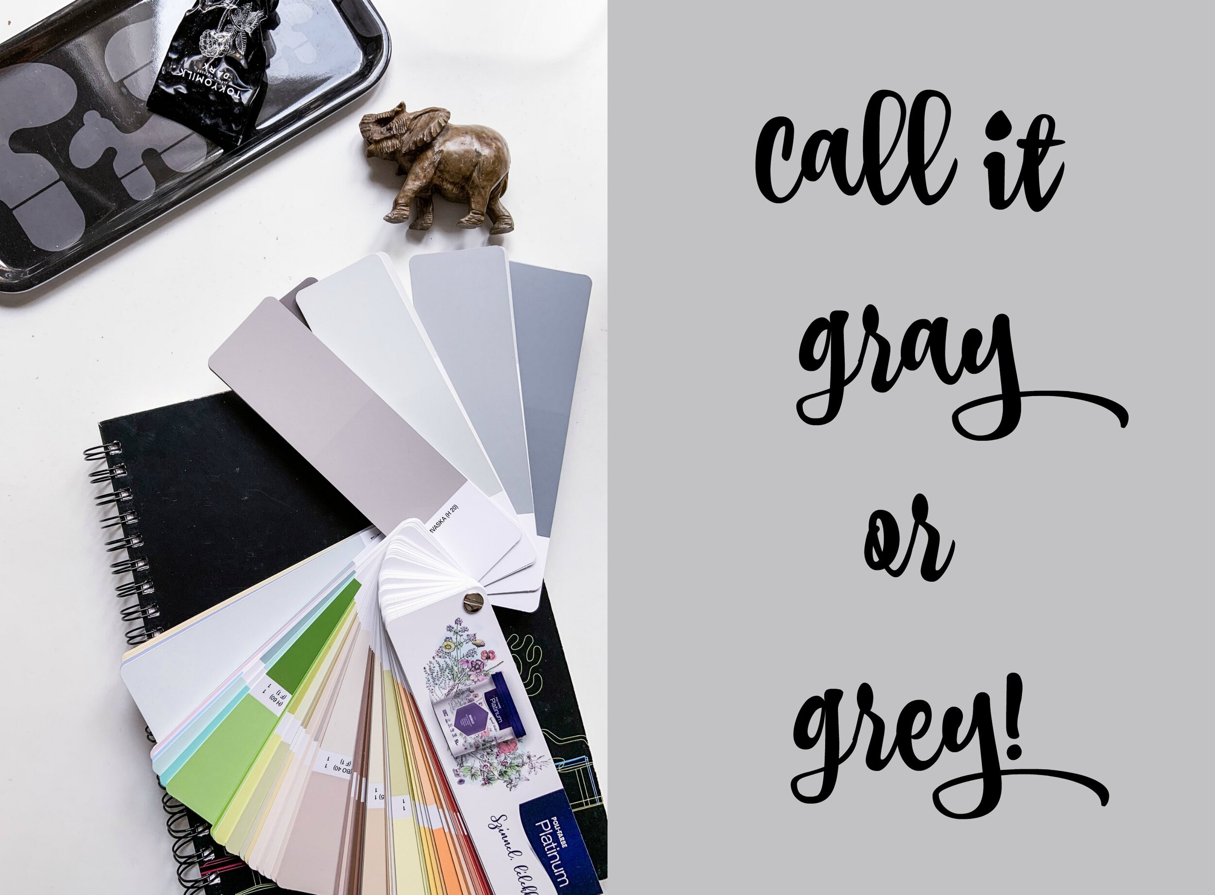
Call it Gray Or Grey!

I call it grey now! But on my Pinterest board I call it gray. Grey has been the most popular colour paint for the recent years - actually for decades especially in Scandinavia. In the north we love grey. I’ve been wondering why, but perhaps it’s because it is so neutral and don’t steel the attention from winter’s snowy whites and summer’s shades of greens. Well, it’s quite grey outside no matter what the season is. Anyways, grey is not a boring colour at all.

Grey is both chic and neutral.  So, it’s super easy to decorate with.  It goes with almost everything.  It’s the new neutral.  Years ago, it was beige, but grey has made it greige - a kind of mixture of these two tones..  Most homeowners, especially those that focus on style, opt for the trendier and more stylish gray. We tend to think that grey is always a cool colour, but there are plenty of different hues of grey. That actually makes it rather difficult to pick up the right one. Even though grey is neutral, there are warm tones and cool tones.

Cool and Warm

Cooler tones include blues, greens, light purples (or mixtures of that include these undertones).  They are more soothing and calming.  They remind us of the sky and water.  Cooler tones tend to recede and hence make spaces look larger.

Warmer tones are made with oranges, yellows and reds.  They remind us of heat and the sun.  They tend to make rooms cozier and more intimate.  They tend to make spaces look smaller.

Pick Up Your Grey

Choosing the paint shade is one of the most common fears among people. Most homeowners don’t have experience or confidence in selecting the right shade. If you walk into a home and you’re super impressed with the paint colour selection, chances are that they had a design expert assist them in the process.

As a general rule, going lighter grey (rather than darker) tends to look better.  It gives a fresh and airy look without making your space look too dark. Always ask for samples to test the colors in your own home, because the paint can look different on the walls than on the paint swatch and it can look different in different lighting, and different times of the day and on different walls, so definitely test using the samplers.

Basic Greys From Poli-Farbe

Poli-Farbe is a Hungarian family-owned paint company. They want to invest in the future, protecting the environment, creating jobs and encourage everyone to create a beautiful home.

LISZTES URÖM ‘floury wormwood’ is a light grey. It has a warm tone.  It goes really well with dark hardwood floors and almost all types of furniture. It has several coordinating darker greys that are great for accent walls 

EZÜSTFA ‘silverberry’ is probably the most popular grey.  It’s a light cool grey, with slightly blue undertones and it’s exquisite. This shade is pretty much a pure grey.  Very calming and relaxing hue. 

SULYOM ‘water chestnut’ is a tad darker than the previous grey. It has some aqua and blue undertones reminds me of stormy sea.

HAMVASKA ‘burnt ash’ is a grey with brown undertones (and some very subtle yellow undertones).  It works well when your room has a mixture of greys and browns.  It has some brown and yellow undertones, so I would call this greige.

PicMonkey Image-2.jpg
greyitis.jpg
PicMonkey Image.jpg